Dashboards
The Cim50 Planning Module has several Dashboards available.
Dashboards can be accessed from the feature on the left-hand menu of Cim50 and provide key performance indicators across the Cim50 Modules.
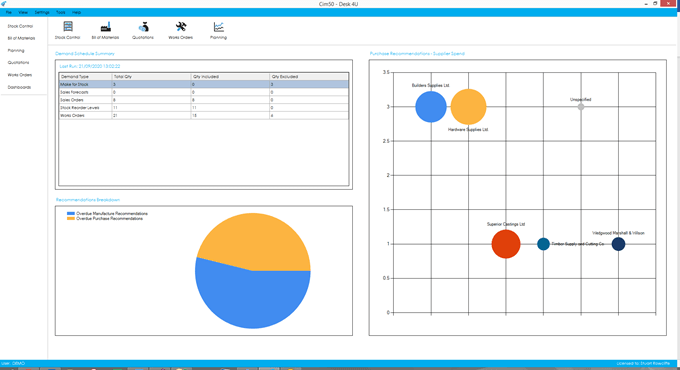
There are 3 dashboards available for Planning. Details on each dashboard can be found below.
To provide efficiency in the Dashboard functionality, the Dashboard data is refreshed nightly by the ‘CIMi’ service running on the server during the Check Data routine. You can also manually refresh data at any time by going to File > Maintenance > Refresh Dashboard Data, selecting all Dashboards or those required.
The Dashboards included for Planning are as follows:
Demand Schedule Summary
This dashboard shows you a summary of the previous demand schedule, providing the same information as the summary screen when manually running a demand schedule refresh.
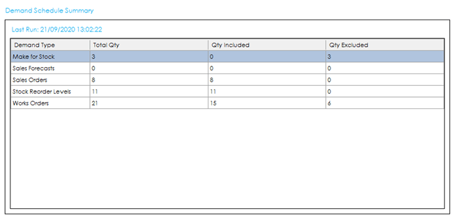
The grid provides you with the following information:
Demand Type: The type of demand.
Total Qty: The total number of demands read.
Qty Included: The number of those demands that have been included in the demand schedule.
Qty Excluded: The number of those demands that have been excluded from the demand schedule.
Double clicking on this dashboard will take you through to the Demand Schedule list.
Recommendations Breakdown
This dashboard shows you a breakdown of the types of recommendations you have from your last MRP run.
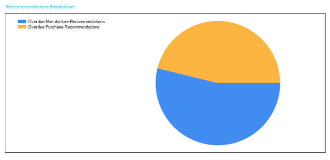
The breakdown will include:
- Purchase Recommendations
- Overdue Purchase Recommendations
- Manufacture Recommendations
- Overdue Manufacture Recommendations
- Cancel Purchase Recommendations
- Cancel Manufacture Recommendations
Double clicking on this dashboard will take you through to the MRP Recommendations list.
Purchase Recommendations – Supplier Spend
This dashboard shows you a bubble chart showing an overview of the expected supplier spend based on the recommendations from the last MRP run.
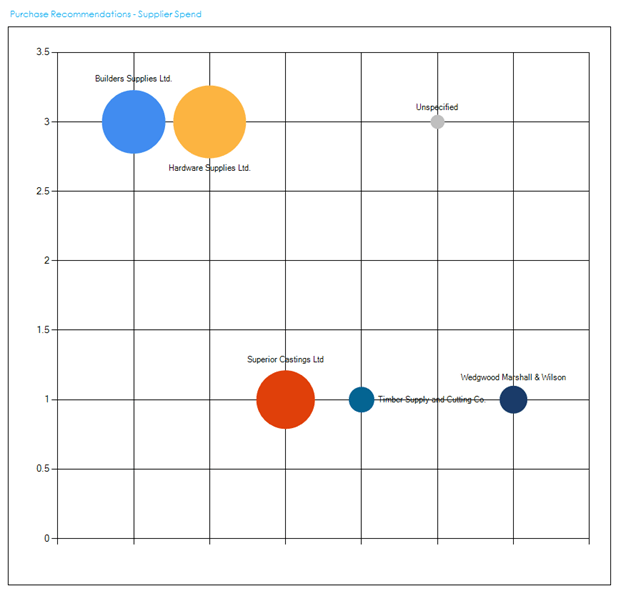
The Y Axis indicates the number of recommendations, so the higher up in the chart a supplier shows, the more recommendations there are to order goods from them.
The X Axis lists out each supplier in alphabetical order from left to right.
The size of the bubble indicates the value of the purchase recommendations. The larger the bubble, the more money it is recommending is spent with that supplier.
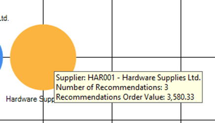
Hovering over a bubble will display the supplier info, number of recommendations and the recommendation order value.
Double clicking on a bubble will load the MRP Recommendations list, filtered to show recommendations from that supplier.
See also
Related
Other tasks